
Menu
The Alignment Lab is an AI consulting firm helping mid-sized AEC companies adopt AI in practical, workflow-based ways. Founded by Renata Pinheiro, the brand bridges construction expertise with emerging technology to help firms align people, processes, and tools around measurable results.
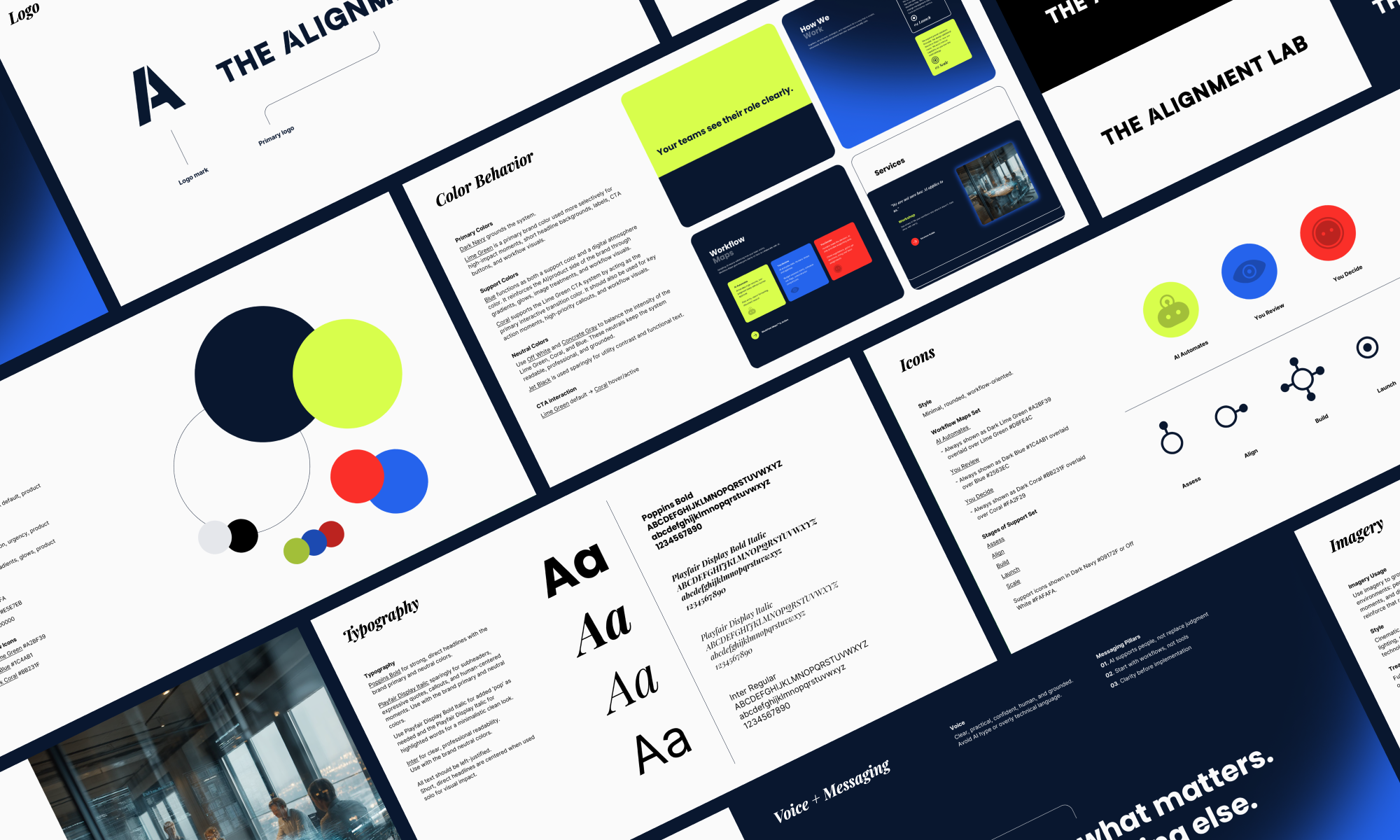
The project included the development of a complete brand identity and responsive website, encompassing logo design, color palette, typography, iconography, branded visual elements, business cards, and brand guidelines.


Logo Font
Satoshi Black was selected for its clean, confident, and modern structure. The logo was customized with select curves to connect to the rounded-square forms and flowing lines used throughout the brand system, reinforcing ideas of workflow, integration, and alignment.
Logo Mark
The logo mark reflects the idea of alignment in action. The separated stem of the “A” suggests two distinct elements working side by side — much like AI and existing workflows — connected by a shared purpose.

Typography
Poppins Bold creates strong, direct headlines that feel confident and clear.
Playfair Display Italic adds a more human, editorial tone for callouts, quotes, and key brand moments.
Inter supports practical readability across web and brand materials.
Colors
The color palette balances credibility with innovation. Dark Navy grounds the brand with authority and trust. Lime Green acts as a primary energy color, signaling AI, activation, and forward momentum. Coral adds warmth, urgency, and interactive movement, especially in CTA transitions. Blue brings a digital atmosphere through gradients, glows, and product-related visuals.
Together, the palette feels fresh and distinctive without relying on predictable construction-industry color clichés.

Icons
The icon system translates Renata’s Workflow Maps™ into a simple visual language. The three map categories clarify the relationship between AI and human decision-making.
Additional onboarding icons for Assess, Align, Build, Launch, and Scale reinforce the brand’s structured implementation process.


Working with Dani on The Alignment Lab brand and website was a genuine pleasure. She took the time to understand what I was trying to build and translated it into a brand and site that captured my vision. The process was collaborative, thoughtful, and easy, and I'm proud to put the final result in front of clients. I'd recommend Dani without hesitation.
Renata Pinheiro, Founder